Level 04
For my first year branding I used a brand name 'j'nae fox' and used bold bright engaging colours, although the type could be reflected I liked the colours used in this branding and the little gift box.


Pro's
- Colour
- Brand name
Con's
- Crafting
- Type arrangement
- Practicality
- Print Quality
- Consistency
Level 05
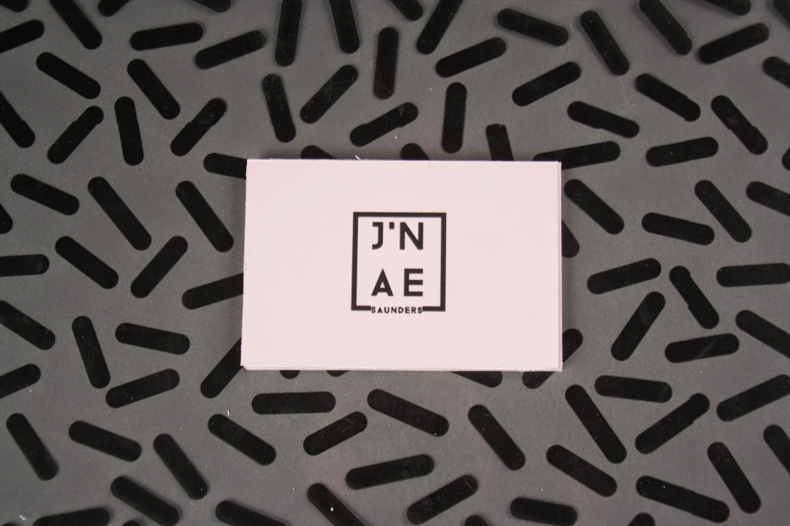
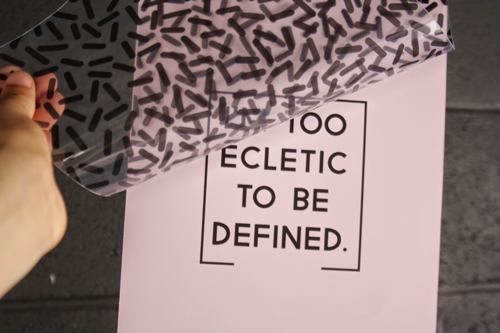
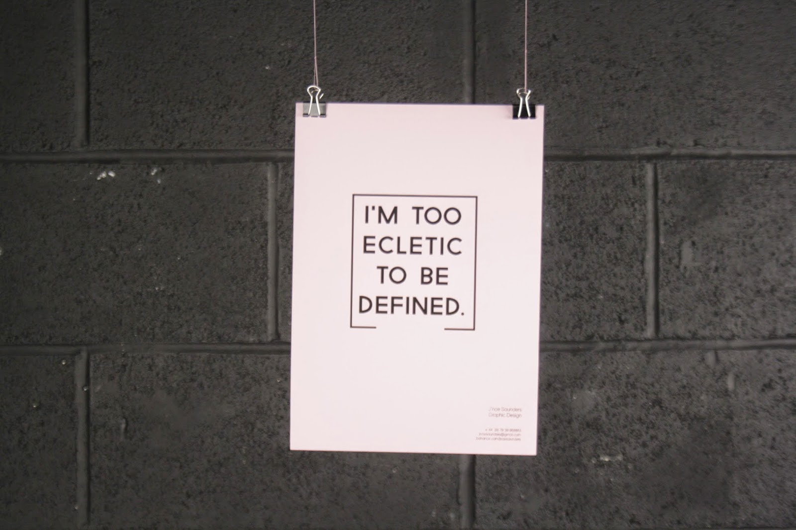
For my second year branding, I didn't take a lot of time to design it, which lead to me creating something that I didn't really like. The pattern was really off key from what I like and the logo was really illegible. I also wanted to experiment with using my real last name this year as I used a branded name the year before.


Pro's
- Materials
- Designer tools
- Photography
Con's
- Illegible logo
- Crafting
- Type arrangement
- Practicality
- Colour
Brand Name
Reflecting on my brand name from the previous two years I went from 'j'nae fox' to 'j'nae saunders' and although I tested out using my real name in second year, I do prefer my other brand name, not only typographically but when working in the fashion industry prior to university this was what I was known by.
So when I changed it, the people I networked with told me they preferred the other name and knew me for that brand name which was a signifying moment in me wanting to re-use it for my final year branding. I feel that by me trying out a different brand name allowed me to test it out and see the pro's and con's of using it.
However already building a brand prior to uni I think it would be more beneficial to stick to it. (However I am very indecisive!) I have had concerns about just using a brand name but I feel it's very much apart of who I am as an individual and i'm not disregarding my own name, but as a brand I feel that this represents me and my journey into design.
Colour / Pattern
I always feel that colour is quite hard to use in personal branding, you have to consider the psychology behind the colour and what it's representing to people. Also the amount of colour needs to be considered for consistency.
In my Level 04 branding I think I used up to 5+ colours, however I think they worked quite well together with the majority of the colour being in black.
For my Level 05 I tried a completely different approach and went for a more simplistic palette, although I do like pastels I felt that the design was a bit bland and didn't really match with the pattern I used which over powered the design and took away from it.
For my Level 06 branding I'm not going to incorporate a pattern, I think it's something i've grown out of and I think using just a monochromatic colour scheme with possible introductions of bright colours or monochromatic colours with one bold colour.
Logo
I've always struggled with designing a logo for myself, I think it's because i'm influenced by a lot of different styles and I think this is evident in both of my branding projects in previous years.
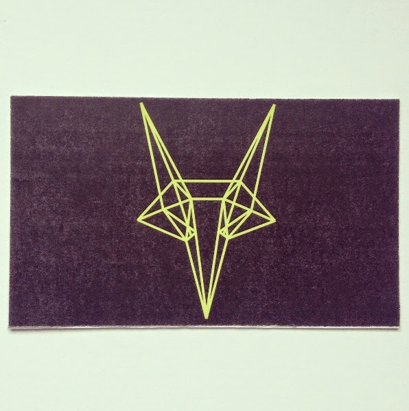
In my Level 04 branding I think I over complicated the logo with using a isometric secondary logo alongside a very decorative type logo, which didn't really work together unless they were used in different areas of the art work.
For my Level 05 I took on what I did wrong in my previous year and completely changed the style all together to something more simplistic, however the arrangement of the type really didn't work and was quite illegible on reflection.
So for my Level 06 branding I'm going to still consider doing something simplistic, but so that it is easily transferable across a range of media and materials using either my full branded name or the initials. Keeping a close eye on the arrangement of the type and how it is laid out.
Overview
Reflecting back on my past projects has allowed me to see how far i've come in regards to my design and how much I have changed and continually do. I think by looking at these it has allowed me to resolve some issues about my branding and what to take forward for the brief.
Although this is my final branding project I hope to create something that I can use for a long time, so keeping the logo strong and simple is imperative so that I can simply change colours and stocks if I wish!
No comments:
Post a Comment