Thursday, 21 May 2015

OUGD601: END OF MODULE EVALUATION

Overview

The PPP module has always been a module that is really interesting for me look back on as a designer, to reflect on the person I was and who I am becoming. My goals, achievements and dreams have all been documented in this module and is really beneficial in allowing me to see where I want to be.

The final year of PPP has been very directed and more refined in who I am visiting, researching and looking at in regards to music and art direction. With this direction it has enabled me to achieve some of the biggest goals I never thought I could!

This module has enabled me to think beyond designing in the studio and behind the screen and has encouraged me to get involved with the design world, go to events, network with people and inform my practice.


Positives Throughout The Module

One of the biggest positives in this module was visiting Barcelona in Spain, I think that I really wanted to push myself in experienced a new design culture and was an ambition of mine to visit in my second year. I opted out of doing another placement, for visits, due to already completing a placement over the summer which I consciously decided to do, because I knew there was going to be a large volume of work to do in my final year. With the freedom of third year I was able to achieve this and meet a amazing designer Oscar Germade who runs Solo studio, who's work I am really influenced by. In doing this I have now made an international contact who I am still in contact with to this day and was really a great opportunity!

Another positive was getting an interview and coming second place to a placement at MTV, never in a million years I thought I could achieve something like this so soon, and with this module and all the workshops within this module gave me the knowledge and confidence to apply for this position and was a big success. The invaluable skills I have learnt about presenting my work really came into play at this stage and although it's been something i've not generally felt most confident about, it really did pay off in the end.


Difficulties faced throughout the module

Difficulties I have faced throughout this module would be my personal branding, I think creating a name for myself that wasn't my real name would have been a bit weird, but non the less I am really happy with the outcome and I justified this through my connections in the fashion industry. I always find personal branding hard because I can't define myself! I feel that I have so many interests that it's heard to create a visual image that represents that. 

However through focusing on fashion and music I think I came over this difficulty and created something that I will be using for a long time.


Skills I have developed throughout the module

The skills I have developed are methods of communication, I have contacted people via email, visits, phone calls and social media! I think I have utilised a lot of methods of contact and have proven to be successful through this module.

I have learned to be more confident in showcasing my work and talking about it, this is something that I NEVER did in my first and second year and with putting my work out on behance I have gained some recognition and felt a lot more pleased about getting feedback from people all around the world and again building a network.


What I would do differently next time

What I would do differently next time, would to possibly spend more time on experimenting with stock and colour choices for my personal branding I felt that was something that I will change later on.

Aside from that I feel I have really engaged with this module in all aspects and really pushed myself to become aware of the industry and gained a lot of lessons and things to improve upon through visits, interviews and so much more. 

PPP will be forever ingrained in my practice and is an invaluable module in allowing me to see and learn more about graphic design and the culture.

Wednesday, 20 May 2015

MAD FERRET PRODUCTIONS: PLACEMENT

When one door closes, another one opens!


Today I received a phone call from Mad Ferret, detailing that my application for a summer placement has been accepted.


Initially I thought that I hadn't got the placement because I hadn't heard back from them in a few months, however the manager detailed there was a lot of applicants and this was the reason why!

The placement will be for one month minimum with a review at the end to see where I could go next, I have a Skype interview arranged for Wednesday the 27th which is convenient in me not having to travel to London and in preparation for the end of year show.

Overview

Although I didn't get the placement at MTV I am really excited to be working and designing this summer, in London for some of Europe's biggest festivals. To get a placement in a field of design that I am most passionate about is a great start to my career as a professional.

This placement will tie perfectly into my passions for art direction and graphic design with not only designing printed and digital material but also builds for stages and scenery within festivals. I am already attending two of the festivals that they design for so I am really excited to see how this all goes!

Sunday, 17 May 2015

PERONAL BRANDING: PRESENTATION BOARDS

I created a selection of presentation boards to summarise the concept, development and finalisations of my personal branding. Detailing choices made and why it represents myself as a designer.


Saturday, 16 May 2015

PPP: UPDATED ONLINE PRESENCE

Reflecting back earlier on in the year about the online presence and social media I wanted to utilise I decided to revisit the list of items that I though best defined my practice and update my identity onto these and reflect on the outcome of doing this.

Behance

My goal was to update my behance to get my name out there more and overall have a more professional presence on this platform.


(Before)


(After)

In doing this I have got an increase of followers, appreciations, creatives contacting me to collaborate and even had my work featured on a renowned behance blog! This has been a goal I set out to earlier on in the year and I am very happy that I have achieved this. I will continue to use this outlet as way of online communication and keeping building my online presence.


Twitter

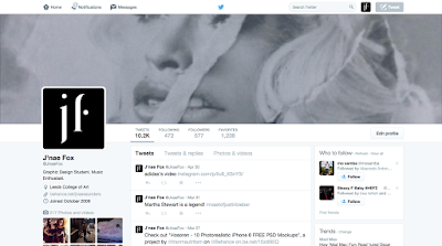
Twitter has been a great outlet for myself to make contacts with my established identity I have now transferred this onto there for consistency, alongside a snippet of some of my work from my portfolio.


I regularly tweet about design events I am going to, ones i'm hosting and even receive testimonials from clients about the work I have produced for them which is great for my practice! 


Instagram

I wanted to utilise Instagram more to update my follows on what I get up to, I post regular updates now of upcoming projects or behind the scenes imagery to keep them informed of my practice.


In doing this I have had a lot more studio's, art directors and graphic designers follow and commenting on my work, which has been really beneficial in regards to networking!

Linkedin

I set up a Linkedin account in first year, which was referred to by John and this has been a really good outlet for networking and posting work or jobs. 


For Linkedin I decided to keep a personal photo as I think the tone of voice of this website is more relaxed and decided this online outlet didn't need updating for that aspect. I still and continue to connect with people on this platform/


Vimeo

(before)


For my proposed online presence I wanted to utilise vimeo to showcase my art directorial skills and upload videos from projects I have worked on. 


My original profile didn't dictate my practice enough so with my presence established I decided to transfer it across this medium adding my logo and my personal statement as a designer.


(after)


From my original presence my updated version is more professional and give my audience another outlet into my practice and more refined idea on what I am about. The consistency across web based channels enhances my personal identity also.


Overview

I have now capitalised on my online presence through branding it and extending it further with additional information about myself as a designer and letting my audience know more about me and my life. In doing this I have made a stepping stone in establishing myself in the design community and I feel that it's been successful so far, when I leave I will continue to keep people up to date with what I am doing to ensure a bigger following.

PPP: PERSONAL BRANDING PHOTOSHOOT

Today I set up some photography equipment and took images of my personal branding, seeing all my items coming together I feel that I have now established a identity for myself as a designer that reflects who I am. 

Over the past 3 years I have gained the confidence to take my own images and set up photography equipment effectively which is an additional skill I have as a designer that will help me towards my career ambitions of art direction. Below are some images from behind the scenes of the photoshoot.


Through my research into other branded identities I took some inspiration for how to layout my deliverables and experimented with different arrangements throughout the shoot to ensure that I got images of all items as well as them working as a collective.

Overview

Although I am a little disappointed with the printed outcome of my designs, I will rectify this through Photoshop and if I have enough time with my pre-booked print slots I will re-print some items to ensure that are of a higher quality.

Friday, 15 May 2015

PPP: PERSONAL BRANDING PRODUCTION

Today I have decided to craft all of my personal branded items that I have created. My crafting is something I have struggled with in the past, but with lack of funds at this stage this is something I have to consider for this project and try to utilise to the best of my ability.


Print Based Deliverables
  • Vinyl
  • Business cards
  • Letterhead
  • Invoice
  • Poster tube
  • Note books
  • Publication portfolio
  • Digital portfolio
  • Bag
  • Stationary

Vinyl

A way for me to transfer my brand was to cut my logo out on vinyl and apply it to my everyday designing essentials. 


Above are a few examples of my logo being transferred onto my pencil case and computer, this is an easy way for me to transfer my branded images across all different type of physical media.


Letter Head + Invoice

In my research I reflected a lot on letterhead and invoice designs, although I have future plans of working for a studio, I have had a lot of client work this year and I think it's imperative that I have an established identity for my audience to relate to that would reflect my professional attitude.


I kept the layout consistent for both designs and printed them on my proposed off white stock for my branding.


Business Cards

An imperative part of networking is through business cards so when designing mine I wanted to make them stand out and being different from the exceeding amount that people have. From my development I decided to have my design portrait as I felt it best suited the typographic arrangement of my logo and also it links to interest in editorial design which is predomintaley set out in a portrait format.


For my business cards I decided to hand craft them through a triplex process by print the front and back separately and applying black card in the centre to go with my initial branded colours. I experimented initially with using double sided sticky tape. But this was a really tedious and ineffective crafting decision and the business cards looked really inconsistent.

I also started to feel unsure about the colour of the stock I had chosen so I then decided to try another option using some matte white stock and going with the same concept but using spray mount to attach the layers.


This proved more successful so I decided to continue this process with my original stock and completed another set of business cards.


However reflecting on these set of business cards I felt that the black stock in the centre made it look like the design had black print guidelines around it.


I then thought I would experiment with another stock in the centre, and used a off white mount board. Although this stock it quite thick I thought it would be prefect for when I am travelling over the summer and that the cards would be with stand all conditions and overall would be durable.


From this experiment I felt the business cards where much more effective and looked a lot more proffesional and were the right weight for my future plans and overall aesthetic.


I then finally decided to create a juxtaposing design of the cards to utilise the colour codes I had decided upon and followed the same process.


On reflection, I think my business cards will be something I will come back and rectify, in the process of printing my other design the ink didn't sit well with the stock. With some pre-book print slots I will look into rectifying these problems. However with the cards I have made, I will photograph them and test out editing them in photoshop to save time.


Note Books

A feature I wanted to include in my stationary was a set of note books, I am always  taking notes, writing lists and going to events and live talks, so I thought have my own personalised note books for my branding would be perfect for my practice.


I printed out a selection of plain, lined, grid and dotted papers to experiment with for my notes books so I had a selection for writing, drawing out ideas and keeping lists.


After applying vinyl to my notebooks I felt my branding was being overly saturated with my logo and decided to keep the note books plain and let the colours speak for themselves.


Stock Considerations

Through the production of my project I have found it quite difficult to decided on the colours to use within my branding. So I brought a selection of different stocks to experiment with. I decided to choose muted stock choices throughout my branding as I didn't want it to distract from my portfolio.


I decided to take some image variations of the potential ways I could incorporate the stocks into my presence 


(nude and white)


(black, white and grey)


(nude and black)

From my images I decided to choose nude and black as I felt these where colours that where sophisticated and worked in a crisp and clean format. I have used a lot of black and white in some of my projects so I also didn't want my work to blend in with my branding. This subtle tonal difference I think will definitely benefit the overall look of my branding.


Digital Portfolio CD

Aside from my printed portfolio I thought another imperative feature for my personal branding would be to create a branded digital portfolio case through the use of a CD. 


I incorporated a black branded disc, my logo and my cv of the back of the cd holder. This feature directly links to my interests in the music sector and flows consistently with my branding.


I also incorporated a black pouch for the CD to stay in for durability when on the move, again this was considered in regards to my plans of travelling in the summer.


Tote Bag


I decided to create a little tote bag with some vinyl I had left over with my branded logo, this would act as apart of my branded stationary and is something I would use for everyday use to carry projects or artwork to clients or meetings. I used a neutral tote bag to fit in with my overall branded aesthetic.


Postcards

Due to my plans of travelling for a few months in the summer, I thought another way for me to contact potential clients of employees was with postcards that showcase snippets of my best work. This will be a nice insentive to show my audience what i'm about and would be convenient when I am on the move. 


I test print my designs on black and white and then I cut out the colour versions applying them to black card for extra thickness. I also chose black as it's a staple colour in my branding. 


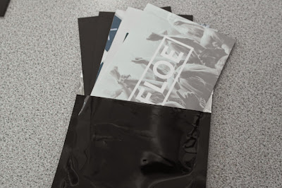
These postcards will be all hand written when they are sent, to add a personal tone of voice as well with my contact details and web presence information on them. The postcards will be sent in water proof black envelopes to ensure they don't get damaged in transit. 


Portfolio

A printed portfolio of my work, is another item I will include in my personal branding for meetings with clients or potential job interviews as an alternative incentive to give to my audience to leave them with some information about myself.

The cover is printed on true grain to allow me to attach it to any colour stock or background depending on what colour I want to choose for my branding. My creative CV is  also detailed on the back of the publication which is alphabetised, highlighting my experience, achievements and additional information about me as a designer.


 Final


Overview

The production of my personal branding has been a bit of challenge in regards to stock and colour choice, this is something I have found quite hard, but I decided to make the decision to keep it simple so the decorative logo would be lost in an abundance of colour. 

I am pleased with the deliverables as I think I have covered a lot of the essentials I will need for my practice. However I think the downfall is the overall crafting of the outcomes. This is something I have always struggled with and I will have to go back and rectify printing errors at a later stage. The black hasn't taken to my choice of stock so this will also be something I will have to look into changing. However I will try and rectify this through photoshop.

I think for the future I will have to consider outsourcing the production of my personal branding specifically for the end of year show!  Overall I think my personal identity translates who I am and has a subtle tone of music and fashion within it's aesthetic and has been my favourite piece of branding from the past 3 years.