After experimenting with my Cargo website, I came across another outlet called squarespace. Similar to Cargo the website allows you to create an online portfolio, so I decided to try it out to see how it would compare.

I signed up for a 14 day trial just to see if I liked this format more than Cargo.

I selected a pre-made theme and I instantly felt that this outlet looked visually better to what I was creating on cargo previously and was much easier to navigate and edit. So with my theme selected I decided to re-build my website using this forum to see what I could come up with.
Intro / Landing Page
From my research and looking into website design I really wanted incorporate an introductory page to my website. With this in mind I created a new page and began experimenting with what I could use.


I started by adding my social network links and changing the header to a copyrighted mark, to allow viewers to connect with me on different platforms and to also make me design legitimate. I also added one of my proposed logos to the corner of the page near the navigation that would run throughout the design template.


I then started to incorporate a proposed branded logo, in the centre as an initial idea, however it looked a bit strange with the same logo on the page, so I decided to experiment further with trying to remove the navigation from this page.

I then thought of creative a gif that featured my work within the centre to showcase snippets fo what the website would be about.


But after uploading it the website was gif was unresponsive, so I decided to go back to having a simplistic logo for the time being. I decided to connect my social media accounts to my home page and website also so my audience can reach me on a multitude of levels, these sights include Linkedin, Twitter and Instagram.
About
The about page is something I though would be really hard, as I think it's quite hard to sum yourself up as a designer and how to define yourself. None the less I began to apply some vital information about myself for clients to understand and resonate with from experience to personal interests.

Using the template I started by adding CV information about myself to features and exhibitions.

However it looked really plain, so I decided to upload a landscape version of my creative CV to the page.


Overall I think looks better than what the original template provided and will transfer with the printed outcomes I have been developing.
Contact
Another feature from this template allows visitors to send you messages that links directly to your email address.
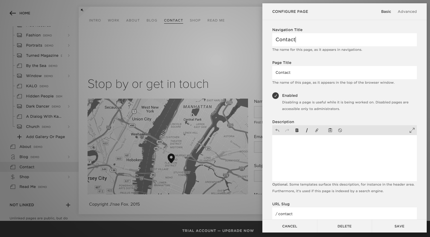


After following the steps, I realised I had to upgrade allow this navigation to work, so if I decide to use this host this will be something I will set up.
Blog
With my 'Make Shit Monday's' Feature I wanted to link this also to my website as alternative insight into my practice, aside from my portfolio work. 'Make Shit Mondays' is a running thing I do in my practice to stay creative through creating something random every Monday in order for me to stay creative.


Using the navigation tools I tried to put in the Tumblr so users would be re-directed.

However this initially didn't work, so I decided to experiment with re-posting my designs using their format.


However I felt the content looked a little too large for the page and wanted to experiment further with how it could be laid out.


I then experimented with more themes of how to layout the photography and finally found a template that I think executed my artwork perfectly to see.

Work
The work page is the most imperative page of my website as it showcases what my practice is about. Something I really wanted was big imagery so my audience can see my work clearly on a digital platform.


I set the home page to have full bleed images that fit the screen so it optimises the imagery and quality of my work.


When a project is clicked onto the project then expands and a scroll of images and is detailed with the project information on the side. I am really please with the size and over all aesthetic of the way the website looks apposed to my previous cargo account.
Price Plan
After some experimentation with my website I was really please with the overall outcome of the website so far and it was extremely easy to navigate and edit. So with that in mind I decided to proceed to investing and setting up with the website.
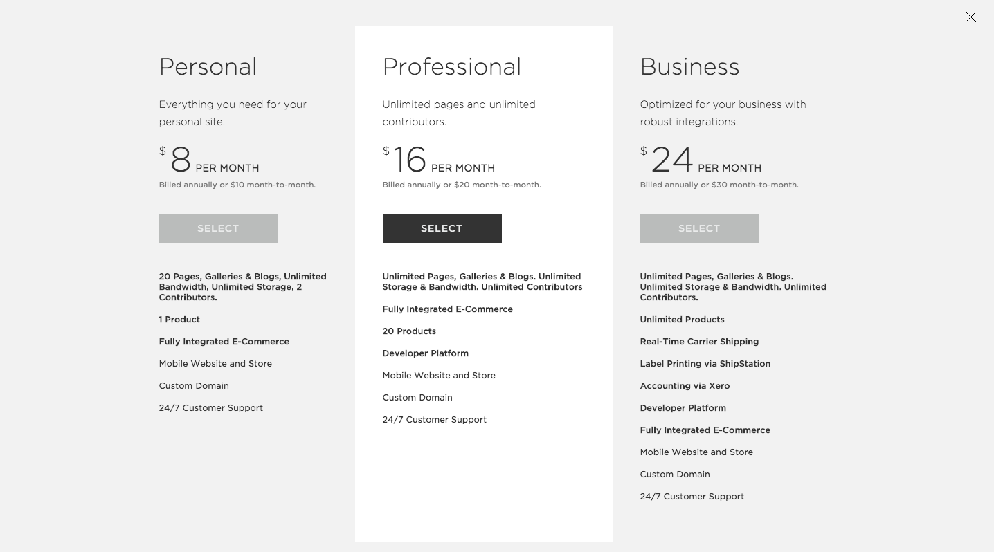

I brought a year plan which would work out cheaper for £61, I felt quite pleased with this price although cargo was cheaper this host provided more for my money and would ensure that my website is mobile friendly which is something I wouldn't know how to do myself.
Domain Connection

After my purchase I linked my domain to my squarespace and made it official.
Official Website
My official website can now be found at www.jnaefox.com ! I am really happy that I made this decision of having an official website. In previous years I have just mocked up proposed websites, so to have an official website that clients and employers can look at is really beneficial for my practice.My next step is to complete the overall aesthetic and upload all my projects.
No comments:
Post a Comment