Showing posts with label OUGD502: PPP 2. Show all posts
Showing posts with label OUGD502: PPP 2. Show all posts
Tuesday, 20 May 2014
Thursday, 15 May 2014


Wednesday, 14 May 2014
Friday, 9 May 2014
PPP2: PUBLICATION
For my publication I wanted to create a picture book / portfolio style pack of my work for people to look through. I also wanted it a big scale so the image were really clear to see, so I decided to work within an A4 format.
Front and back cover ::


Introduction and contents ::


Quote page ::

Editorial edge ::


For The Love Of Print ::


Ascender ::


Asos ::


Women In Colour ::


Final Design
Wednesday, 7 May 2014
END OF MODULE EVALUATION: OUGD501 - CONTEXT OF PRACTICE
1. What skills have you developed through this module and how effectively do you think you have applied them?
I have also learnt a lot from the mini study tasks given for the module, this constant challenge for writing and practicing different methods has enabled me to achieve a better understanding of how to construct a well written essay, which I have applied to my final essay writing work.
2. What approaches to/methods of design production have you developed and how have they informed your design development process?
I have also used my work across a multitude of platforms to show the range in which my ideas and theory can be expanded. For example instead of actually creating an exhibition I mocked up a design for it, this has not only saved me time but also money and has allowed me to push my idea's further for people to connect with.
3. What strengths can you identify in your work and how have/will you capitalise on these?
I have a strength in writing and making arguments, I think I will continue to develop my skills in triangulation and other argument methods to strengthen my essays. I will also capitalise on this skill by looking into more theorists and focusing on one or two instead of multitude to build a strong argument and to show that I have really studied in depth with the writers thoughts.
4. What weaknesses can you identify in your work and how will you address these in the future?
I think my weakness when it comes to context is ensuring that their is a design element synthesis between my work and my essay. I will develop this by looking further in to more associated design contexts and doing first hand research. Another weakness of mine is trying to keep consistency throughout a design. I think for my black myth posters I should have kept them more minimal to fit in with the rest of the posters overall aesthetic, no the less I am still happy with what I produced.
5. Identify five things that you will do differently next time and what do you expect to gain from doing these?
To produce more developed outcomes for a brief to enable the best concepts and work are produced.
To spend more time of focused research to make stronger arguments in my essay, this will heighten my writing ability.
To be realistic with my concepts and the time frame in which they are given, this will avoid me from making mistakes and overworking myself.
Spend more time with the crafting of my work this will enable a more professional aesthetic.
To create more mock ups and thumbnails to create a range of idea's.
6. How would you grade yourself on the following areas:
(please indicate using an ‘x’)
5= excellent, 4 = very good, 3 = good, 2 = average, 1 = poor
| 1 | 2 | 3 | 4 | 5 | |
| Attendance |
x
| ||||
| Punctuality |
x
| ||||
| Motivation |
x
| ||||
| Commitment | x | ||||
| Quantity of work produced | x | ||||
| Quality of work produced | x | ||||
| Contribution to the group | x |
Overall I have really enjoyed this module due to me choosing an issue, that I felt strongly about and was personal to me. I am really proud of what i've done and although I could of made a few design decision changes, I will now look forward to progression to my 3rd year of COP and challenging myself with a new topic!
PPP: WEBSITE
Due to time constraints I decided to use an alternative hosting website, called format to publish my work onto, There was 3 working pages for me to design and create which are listed below.
Home: A Collection of my work in a gallery format., When the images are clicked onto the my work becomes more in depth with more pictures and added description.

About: Some background information about me as a designer and as a person.

Contact: A list of my alternative portfolios and immediate contact details.

Link to Live Website: http://jnaesaunders.4ormat.com
As side from creating this live online website, I also decided to mock up another website that was more in detail.
Home: A gallery of my work with pale pink shadowing over an image when clicked onto.


About: in-depth about me as a designer and my trademark poster.

CV: A in-depth run through of my CV and what I do

Contact: A list of my alternative portfolios and immediate contact details.

Tuesday, 6 May 2014
PPP 2: CREATIVE CV
For my creative CV I wanted to keep it again quite minimal to fir in the rest of my branding, due having all my work in a branded pack with a proposed publication of my work I didn't want the elements combined to be too over bearing.
I used the same grid as I did with my letterhead and applied information about my skills, interests and education so that people would get a wider sense of what I am about as a designer.


I developed the CV by experimenting with the placement of text until I found a consistent and clean design I could work with.
PPP 2: POSTER
Alongside my other printed material I wanted to create a quote poster to sum up who I am, that the agencies could relate to or keep as a gift.
I created this poster based on conversations I had with people on what they though about me and the comment that stood out to me the most was "your too eclectic to be defined." with this in mind I started to experiment with my branding style to create a final outcome.
i initially again experimented with my pattern to see the how it would look but felt the legibility and readability of the quote was lost.


I then decided to simplify the design to make it more legible but I still felt the design looked bare.

I then reflected back to my logo design and decided to incorporate the same square structure around the quote to make the branding more cohesive.

I came up with this as my final design and was really pleased with the final outcome, although the pattern didn't work with it if it was going to be printed I will further experiment with putting my pattern onto other stocks to see how I can make the poster more interactive.
PPP 2: LETTER HEAD
For my letter head I wanted to keep aesthetic approach throughout my design so I simply added my logo, my address and a fake address to whomever I wanted to send it to.


I created the documents in Indesign using a grid to ensure that it was consistent throughout the design. I also used both of the colour within my colour scheme to show variety. I made the conscious decision to leave my letter heads blank because I wanted to hand write on the to give my messages a more personal feel, I think that doing this is shows who ever I am sending a message to I have taken the time to write to them personally but still keeping in line with my branding aesthetic.
Monday, 5 May 2014
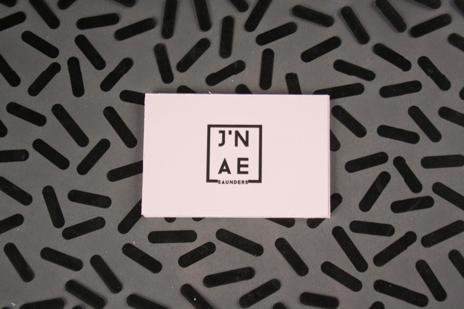
PPP 2: BUSINESS CARD
After choosing my colour pallet, pattern and logo, I decided to start incorporating these design features into my printed work.
I began by experimenting with my pattern around the business card trying different lengths and weights on both sides of the business cards. I worked within a grid in Indesign and mocked up nine business cards within the grid that I could print a multitude of times.


However when experimenting with this I felt that the cards looked really garish, so I decided to simplify my design a little more.


I incorporated my logo with a full bleeder pattern on the back of my design, but realised the practicality of the design was not very useful as there was nowhere for me to put my contact details.
I then simplified my design further by cutting out the pattern and using my primary colour as a basis to work from.


For the back of my designs I reflected back to my primary research and laid out my contact information appropriatley to what I had seen to get a more professional feel. I feel like this design is more clean. professional and I have everything I need on there information wise.
Subscribe to:
Posts (Atom)